
Fleur of England
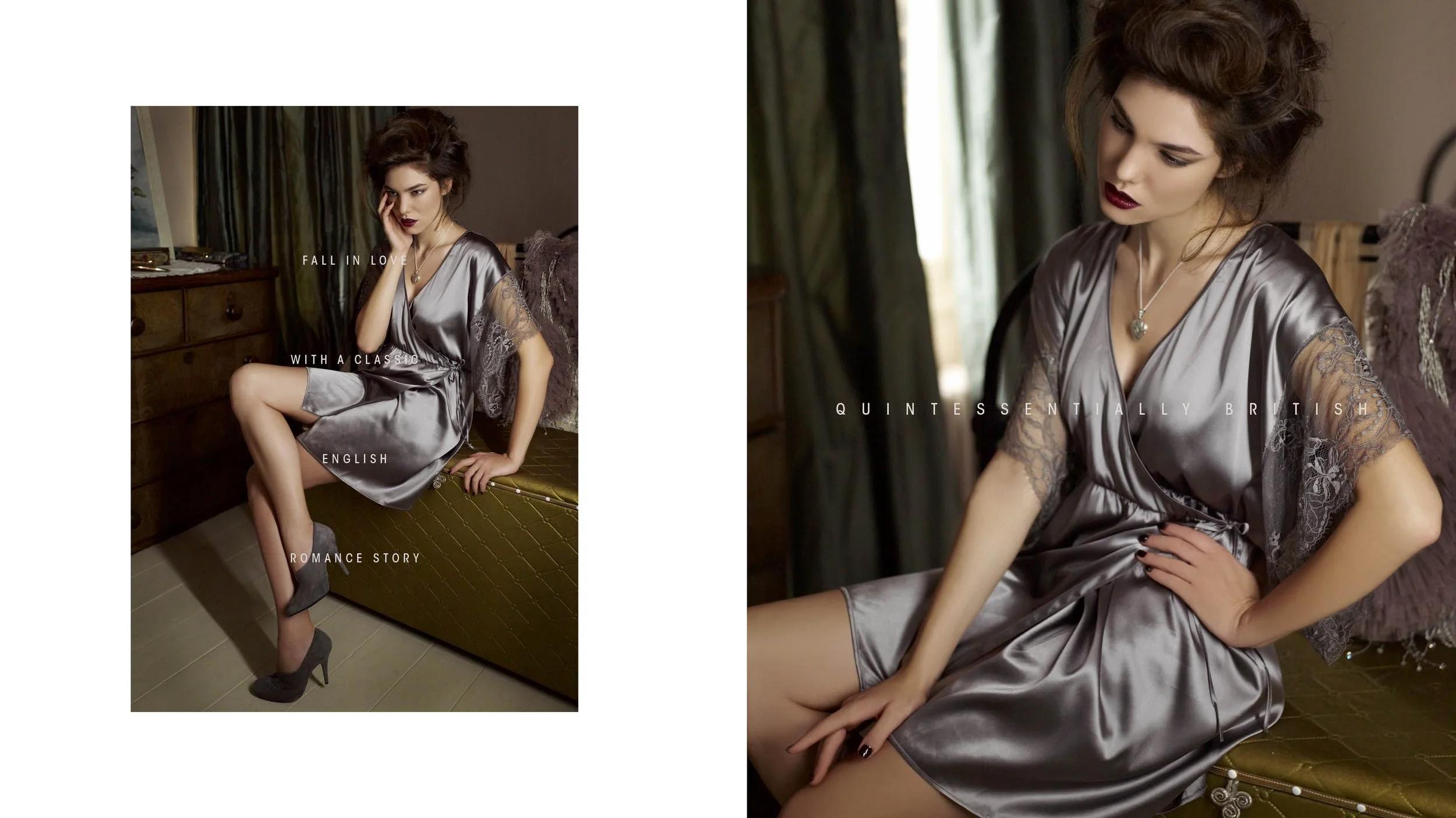
Quintessentially British
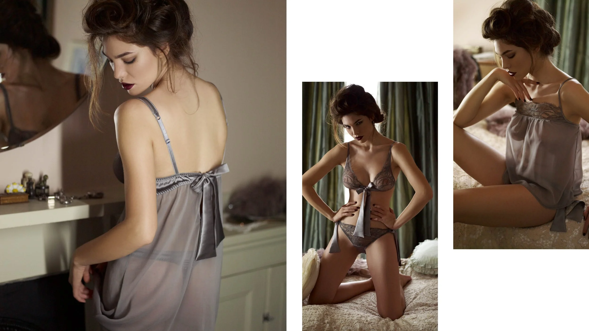
We undertook a comprehensive rebrand for Fleur of England, a luxury British lingerie label renowned for its exquisitely crafted silk and lace designs. With a reputation for elegance and quality, the brand required a refreshed identity that would honour its heritage while positioning it confidently in both domestic and international markets.


Central to the project was strengthening Fleur of England’s distinctly English character, reinforcing its heritage as a mark of timeless luxury. The refined visual language was carefully designed to resonate with discerning customers in boutique stores across the UK and overseas, highlighting the brand’s craftsmanship and exclusivity.

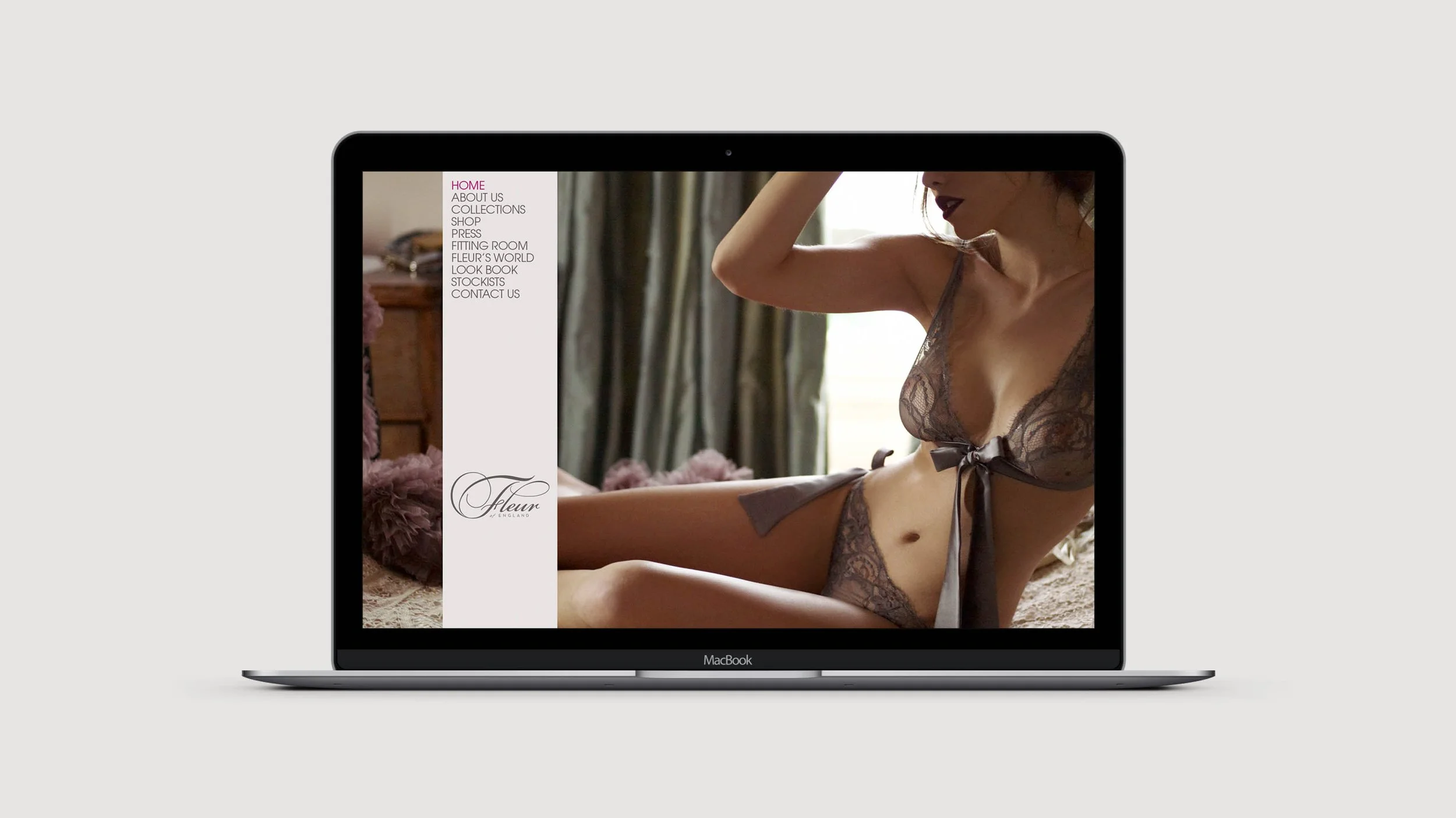

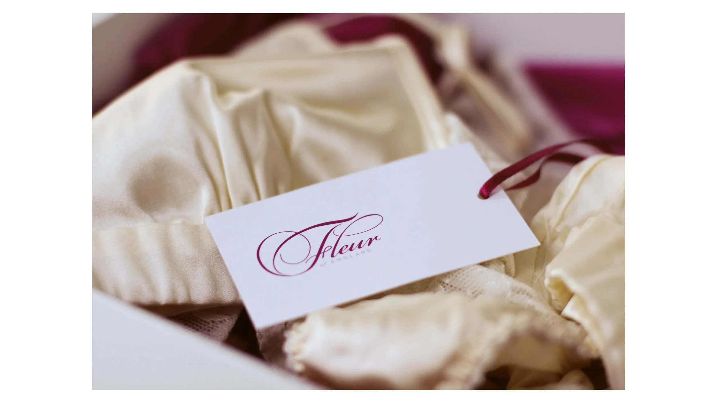
The new identity features delicately crafted typography that embodies the femininity and sophistication inherent in each piece of lingerie. Every element was created to reflect the meticulous attention to detail and care invested in Fleur of England’s collections, elevating the brand’s story through design.


This thoughtful approach to branding was recognised with the Best Corporate Identity award at Cream Yorkshire, celebrating the success of a brand identity that beautifully balances tradition and modernity in the luxury lingerie market.