The House Whisky
A Story Distilled in Yorkshire
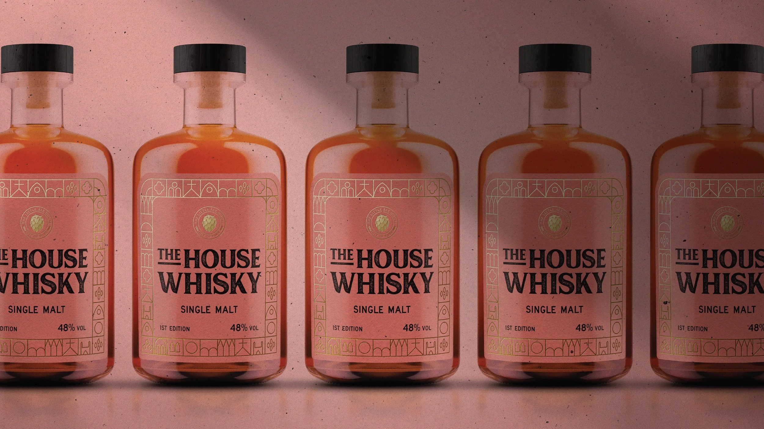
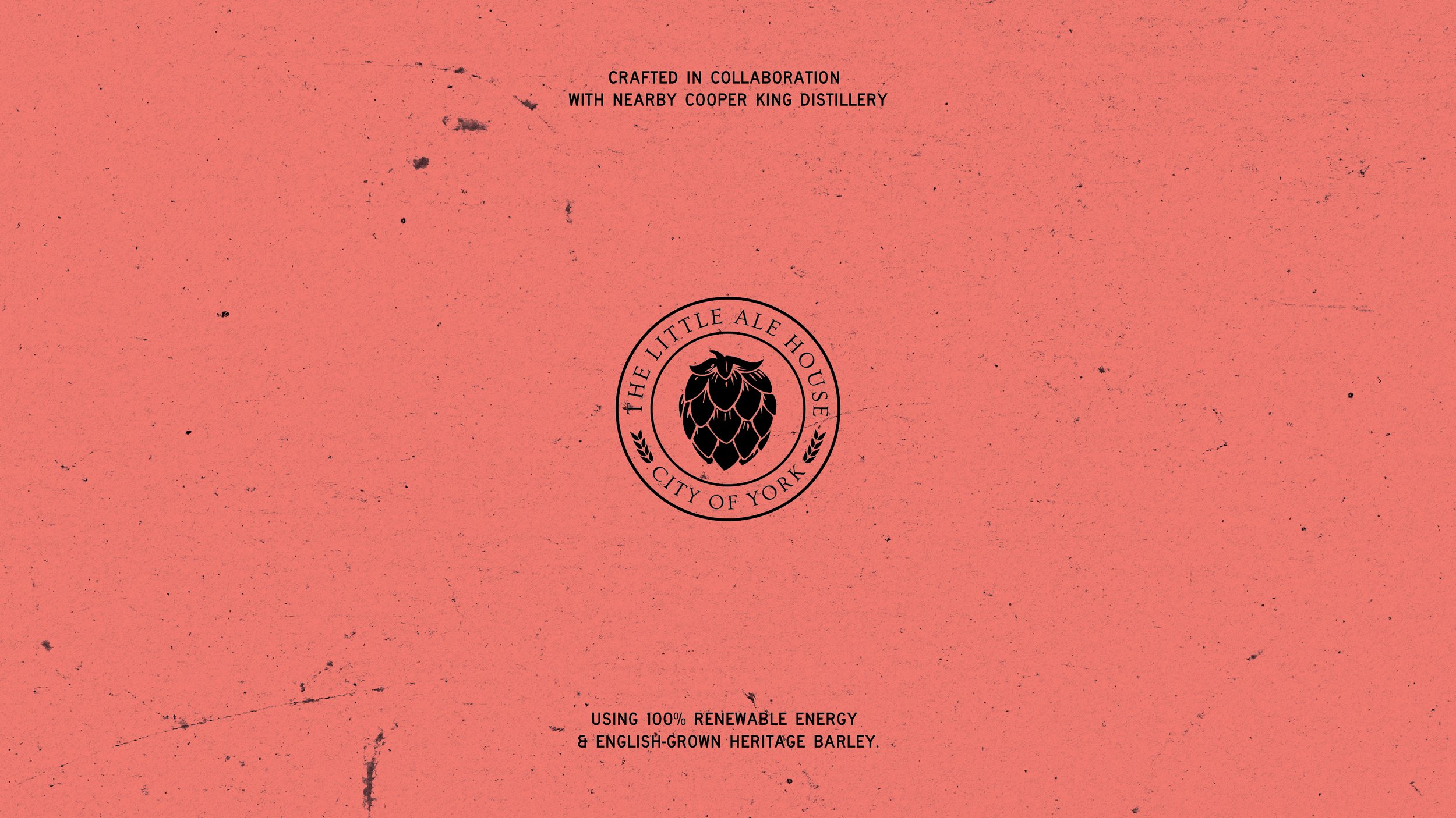
We partnered with The Little Ale House York to develop the packaging for The House Whisky - a limited release crafted in collaboration with nearby Cooper King Distillery using 100% renewable energy and English-grown heritage barley. The brief was to create a label that celebrated the whisky’s provenance while feeling distinctive, modern, and at home behind the bar.
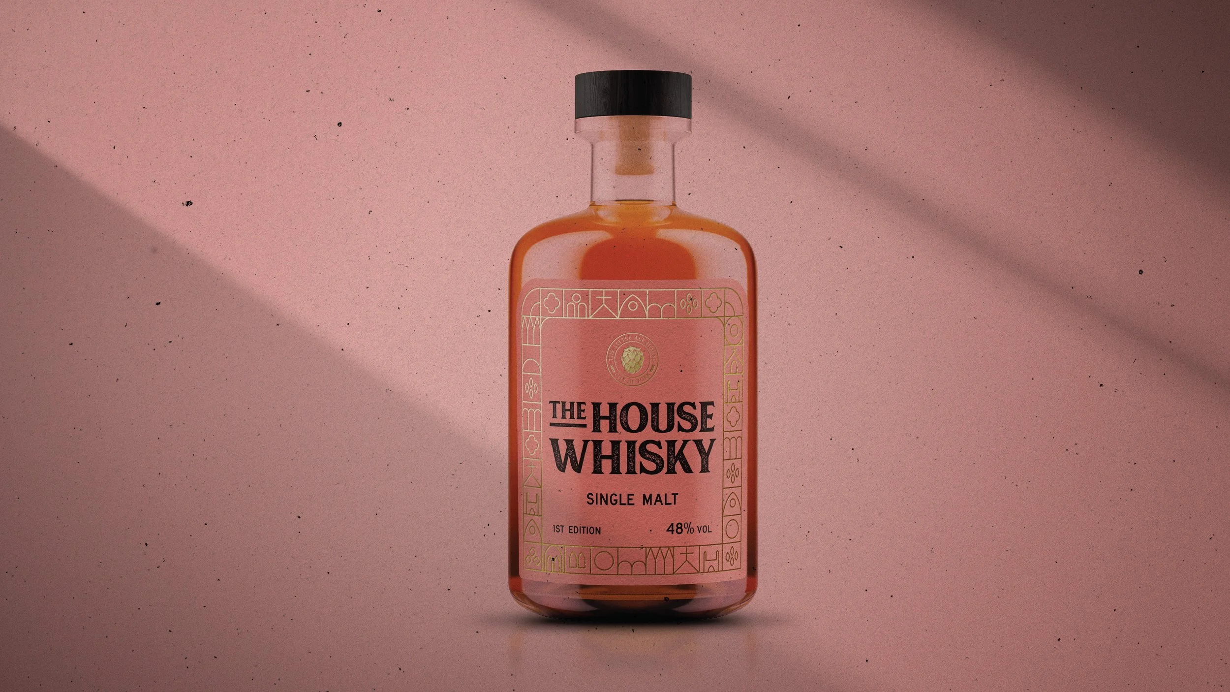
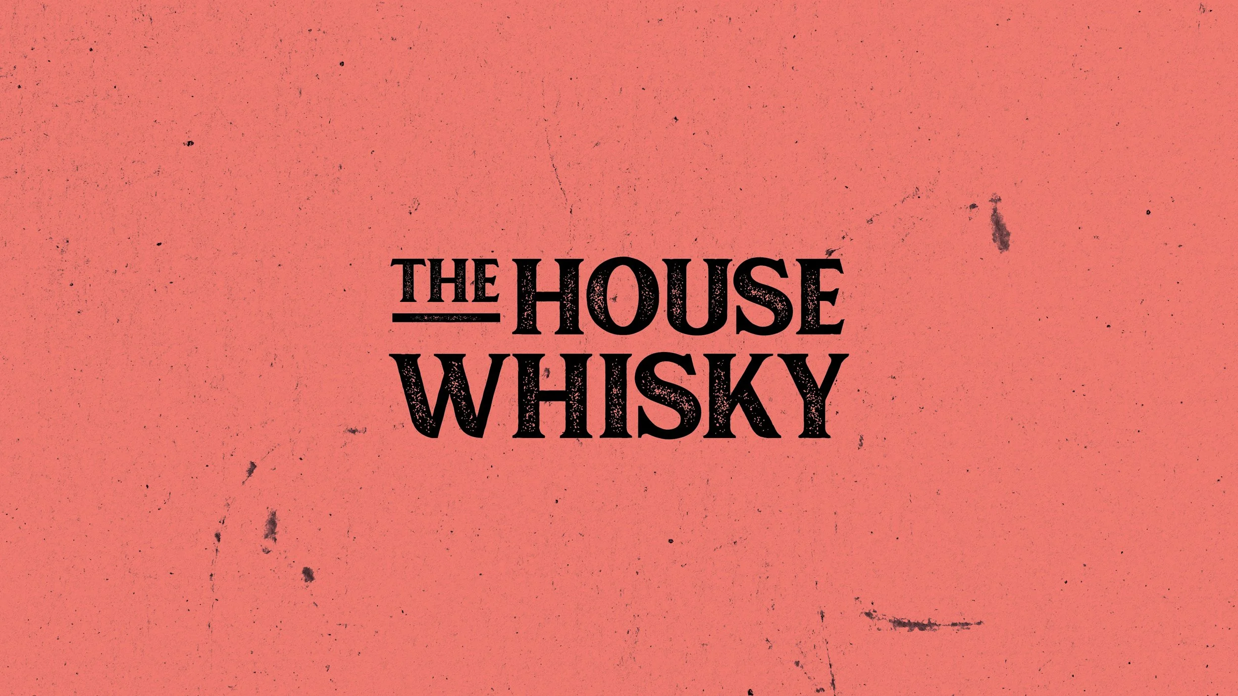
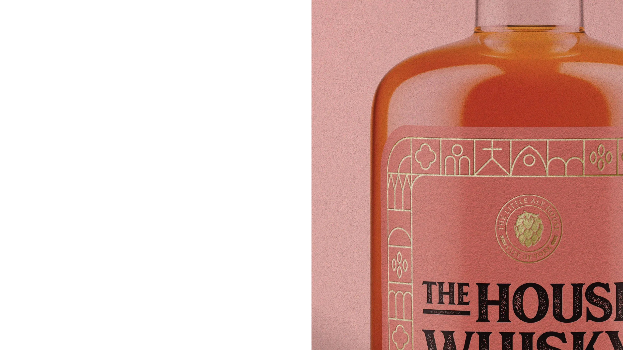
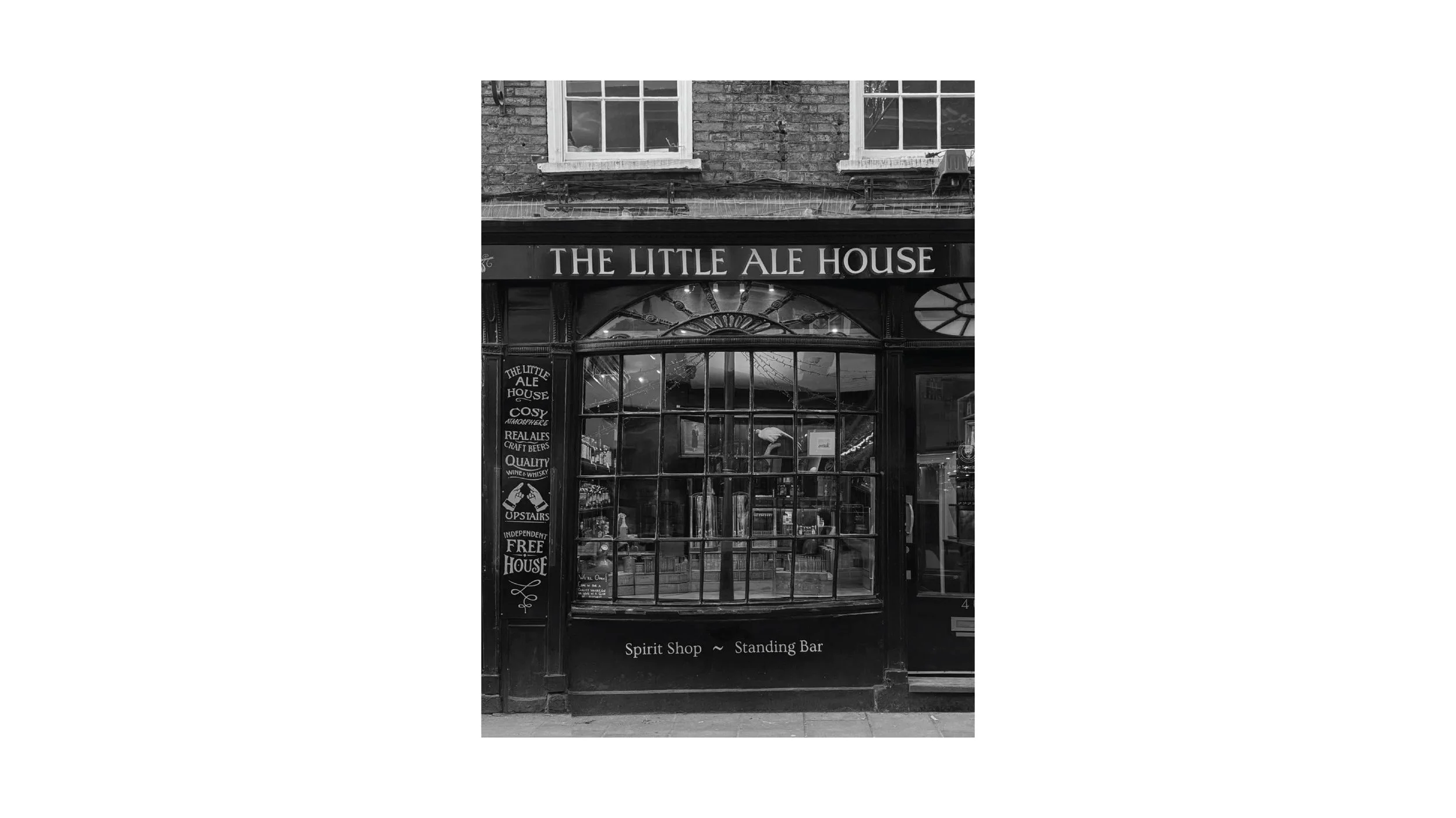
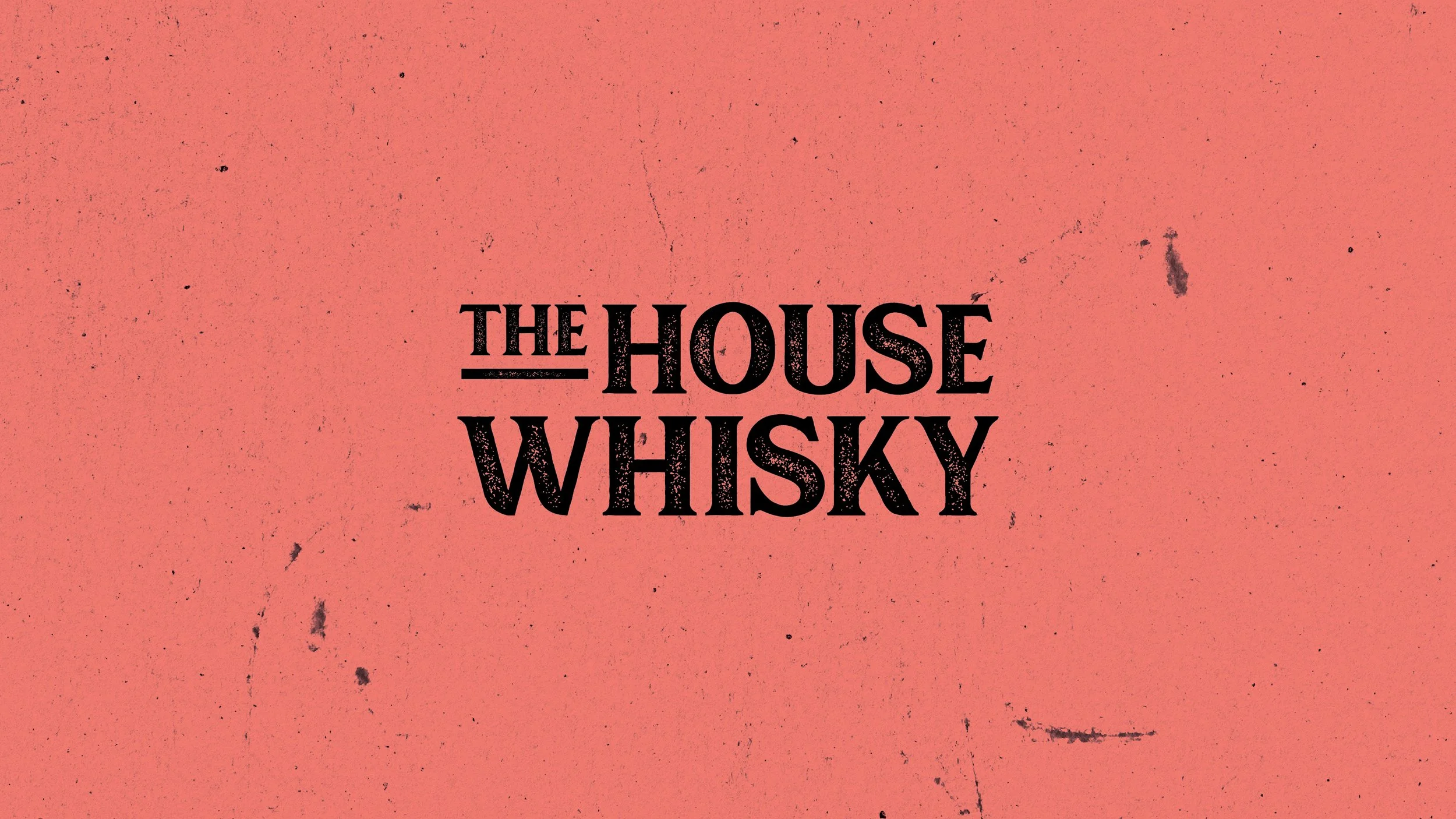
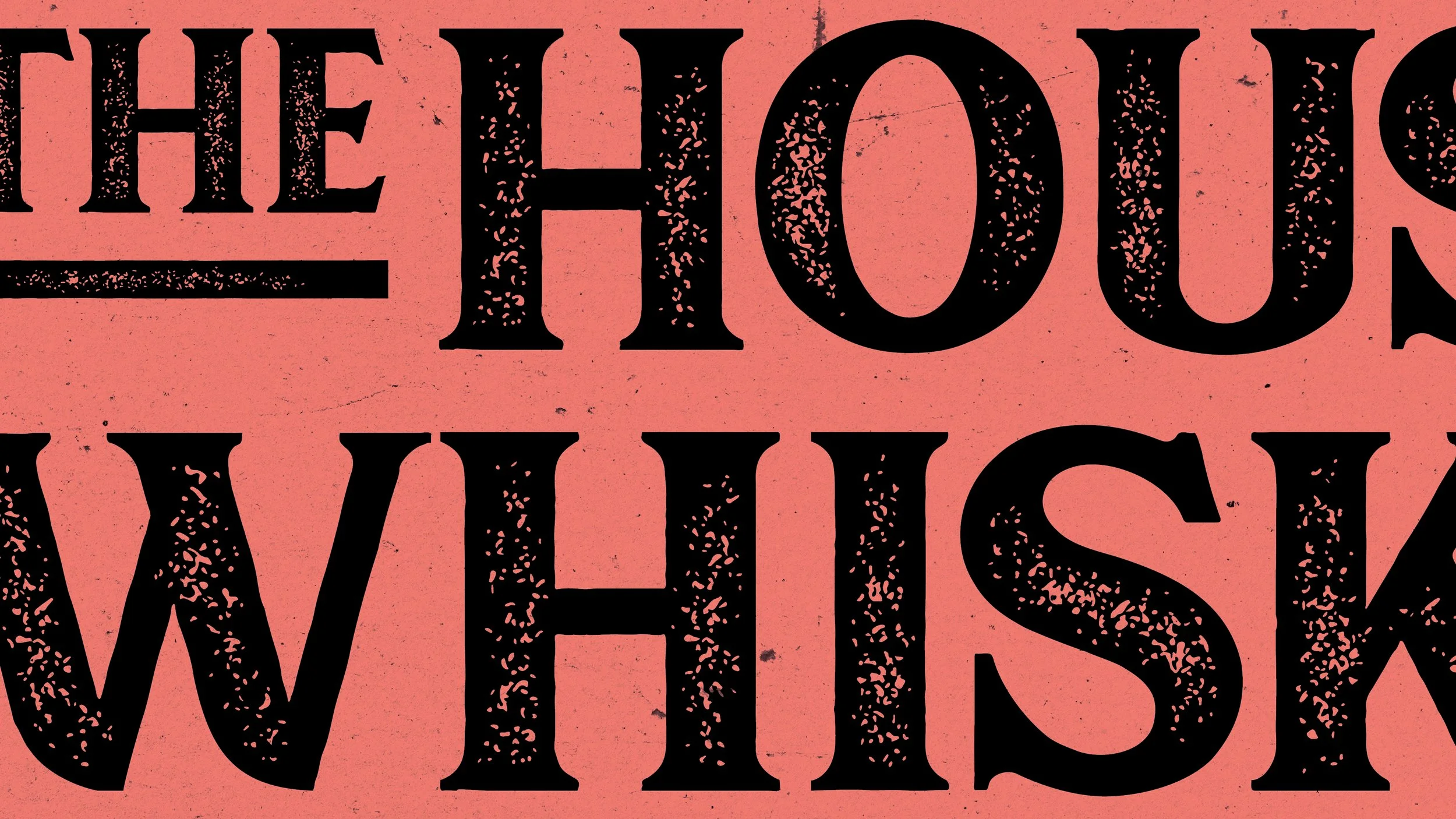
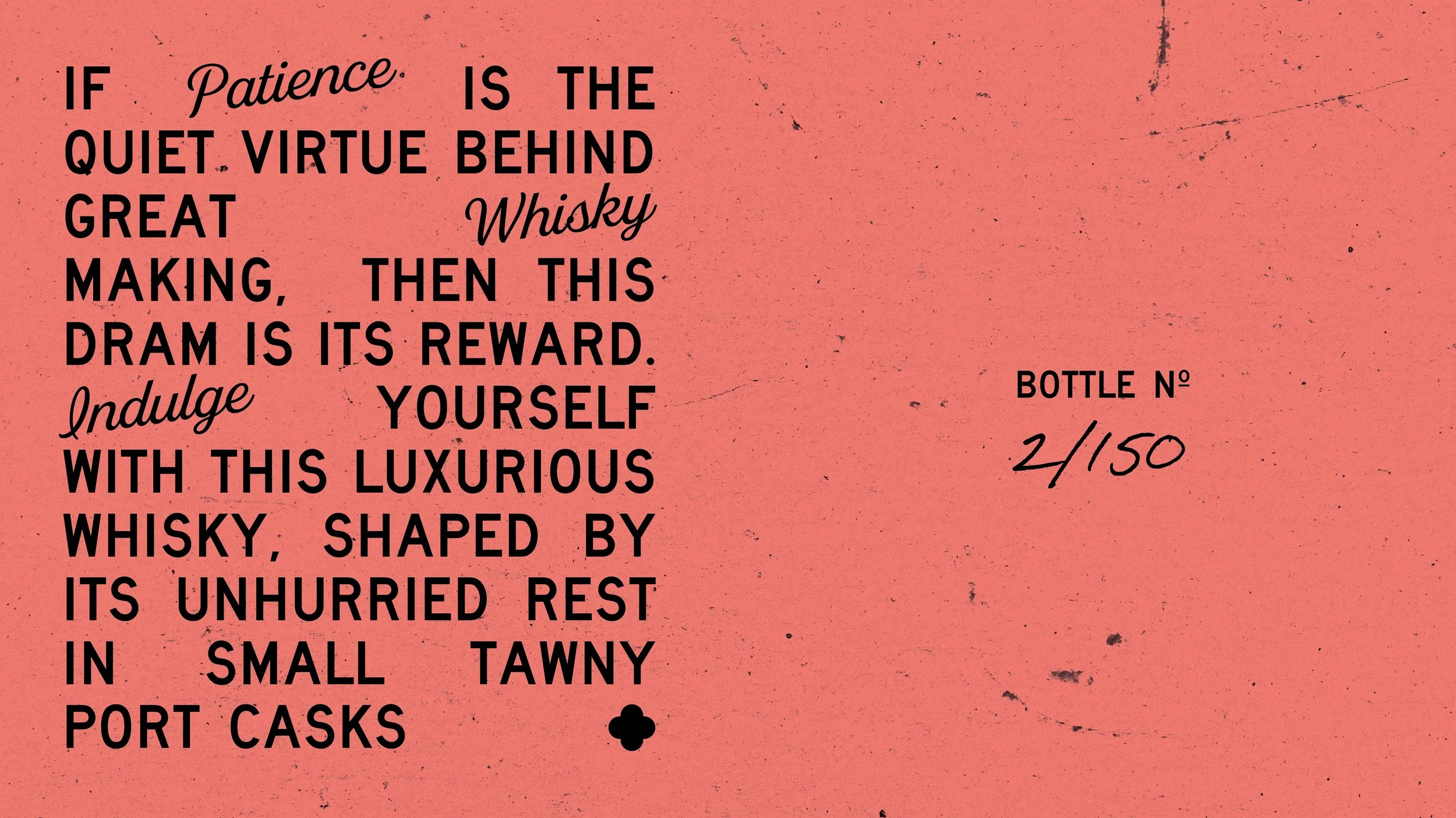
At the heart of the design is a bespoke typographic treatment inspired by traditional letterpress printing. The carefully considered typography brings an authentic, handcrafted quality to the label, while a vibrant pop of colour introduces a fresh, contemporary edge that reflects the progressive spirit of the collaboration.
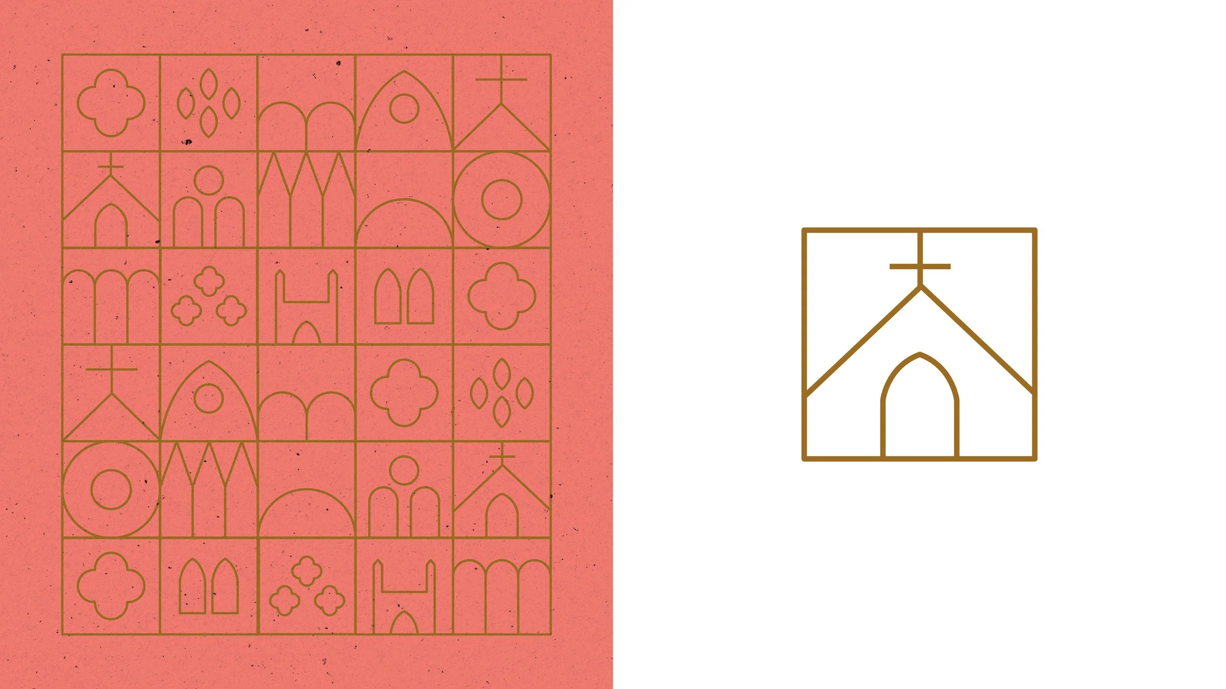
To further root the brand in its Yorkshire origins, the decorative border draws inspiration from the intricate architectural details of York Minster. These ornate motifs have been reinterpreted in a clean, modern way, creating a subtle nod to the city’s rich heritage while giving the packaging its own distinctive character.
Every element of the design was created to tell a story — balancing history with innovation and craftsmanship with personality. The result is a packaging identity that captures the care and patience behind the whisky itself, bringing the values of the brand to life through thoughtful design and meaningful visual storytelling.